Get tangled with Tattered Angels

Did you happened to know what a great tangled paper and pack collection Tattered Angels has? Not yet, so why don’t you check it out, here on this link. The Tattered Tangles are printed on easy to mist or colour leather papers. I used Glimmer glazes to paint all my tangles, and I created an art journal page:

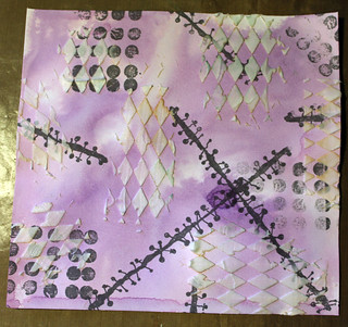
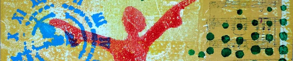
First I used black high impact paint to colour my spread.

Than I added some stamping with handwritten text from Savor the moment stamp set.

I used Little stripes tangled paper for my collage and Dreams tangled pack for my word. I coloured the with Glimmer glaze (desert sun, sweet pea, island spring and paradise pink). I trimmed the lines and the letters and I collaged them on my spread.

Finally I added some flower embellishments to my spread:

So why don’t you go and get yourself some Tattered Tangles and create some amazing journal pages or cards or atc’s for yourself!

Posted in Art Journal, Showcase | Tagged , , , , , , | 14 Comments

Colour speaks all languages

Colour speaks all languages” said Joseph Addison, and I totally agree with him. Looking at an image, no need for words, the colours can tell you if it is warm and happy or if it is cold, distant and sad. Thinking about colouring pages the good thing about it that every and each one of us can create a different feeling choosing different colours to feel the gaps. Well just got another idea: what if we have a coloured page and we create on it an image like opposite to personalize? This is what I tried on this spread:

 So first I colorised my spread using bistre and Plane Jane simply sheers (peoney, soft peach and tangy lime).

On one side I added a female portrait and tangled/doodled around her.

On the other side I also stamped my quote next to my tangles.

I am sharing my spread with Journal 52 prompt: colouring book.

Posted in Art Journal, Showcase | Tagged , , , , , , , , , | 24 Comments

Numbers

Jackie’s challenge at Stampotique designers challenge blog is to use numbers in our creation. As I am a an art journal freak, I made for you a spread with numbers:

I worked in my altered book for a change. As I just cleaned up my box of laces and fabrics first I created a collage from some left over on my spread:

I wanted to add some colour, but rather grunge style, so I took some light prussian blue acrylics and my brayer and just spread that colour all around. I used white chalk spray to splatter a bit on the blue.

I used France’s typewriter alpha set for the numbers with black archival ink. I also added a bit of a shadow stamping with the splattered mug stamp for some more texture.

On the other side I applied some thread and some other found objects as embellishment, number 9 was stamp on a card stock, trimmed round, distressed and positioned on a burlap piece.

Why 9? I have no idea, I guess today I have a 9 day… it might be because of all the clouds and no sunshine. So why don’t you take your number stamps and join into the challenge over at Stampotique designers challenge blog.

Wonderful weekend everyone!

Posted in Art Journal, Mixed media, Showcase | Tagged , , , , , , , , , , , , | 24 Comments

Earth brings – earth takes

We are leaving the winter and going into the spring time. It means that all what earth took away with its brilliant red/golden colours, after a long cold white/blue sleep brings back in vivid greens. I made this spread in my journal celebrating the incoming spring time:

As nature is so bountifully showing his ripened treasures when he says good-bye at the autumn time, so much it is restraining itself at the moment of the awakening showing us only different tints of green before the full blossom. I was beginning to paint my whole spread with light chrome green acrylic mixed with white.

Next I added some black and white as still it is a struggle to stay hidden under the ground or to come out to the light.

I used fluid acrylics, misted with water or applied with bamboo pen and plastic card. I painted a book page with the same light chrome green that this time I mixed with black for a darker tint. I cut round shapes to form sprouts like the seed coat is still on the first leaves. I used black art marker to draw the stem and to doodle around.

Finally I added my quote that comes from Lucan: “death is free from the restraint of fortune, the earth takes everything which it has brought forth”. Now we are at the very beginning, earth brings us our spring forth.

I guess we should all go out and enjoy that new beginning.

I am sharing my spread with Journal 52 prompt artistic restraint.

Posted in Art Journal, Showcase | Tagged , , , , , , , , | 12 Comments

Green

It’s time for a new challenge at Anything but a card blog: Green, isn’t that the most beautiful colour of the spring. After the long winter that we could see only white, or grey it is a great pleasure to the eye to discover some other shades. Nature is dressing in different tints of greens, exactly like trees, flowers and the grass would envy the colour from each other. So for a warm welcome of the spring I created this home decor piece.

I used a wooden flower shape that first I covers with a layer of gesso, then I sanded it.

Then using France’s Romantic text from Stampotique I added some texture with archival ink.

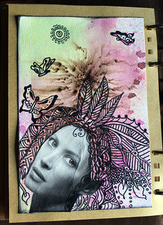
I wanted some dimensional texture as well, so I used texture paste. Then I coloured it to green.

I cut a heart shape and painted to light green. On a scrap paper I stamped “green” and distressed the edges. I added a four-leaf clover embellishment to my heart.

I layered a piece of paper dolly, some thread and cambric under my heart.

I wanted to add some flowers, these ones I coloured with purple lake and light green for a distressed effect. I used a stick of cinnamon for some smell.

Finally I found a green butterfly, butterflies give me the feeling of transformation of the nature after winter going into spring.

So how do you like the green shades of spring?

Here are some details for you:

So why don’t you join our challenge at Anything but a card blog and show us your tints of green!

Posted in Home deco, Mixed media, Showcase | Tagged , , , , , , , , , , , , , , , , , | 20 Comments

Black with some colours

I guess I am in love with black and metallic colours, oh yeah and recycling. I had a 6×6 canvas and a few found objects that I wanted to give a new life, here is the result:

Would you like to see what my found objects were? Well let’s go step by step: first I had a layer of lace, then a piece of burlap and some waxed rope. Then I had a piece of zipper, a bottle cap, a burnt out bulb, some nails, other construction materials, 8 found fallen on the street, and trimming mats. Voilà:

Enchanting treasures, now all these got a layer of black gesso as a cover:

After it was drying it got two colour layers: pearlescent liquid acrylics and inka golds.

Pearlescent liquid acrylics: platinum pink, galactic blue, autumn gold and sundown magenta. Inka golds: rose quartz, aquamarine, mint green and yellow gold.

I am sharing my canvas with Mixed media place Creative Gym – Exercise #5 black background + all the colours of the rainbow.

Posted in Canvas, Mixed media, Showcase | Tagged , , , , , , , , , , , , , , , , , , , , , , , , , | 18 Comments

Happy Unbirthday!

Sweeties, what’s about an un-birthday? Isn’t that a great idea? I need to admit it, it wasn’t mine, it’s from France Papillon at Stampotique designers challenge.

So HAPPY UNBIRTHDAY!

I used  white card stock and I coloured it with sand yellow ecoline and bistre. I distressed the edge and made it pop with chalk edger (metallic copper).

I used France’s design cube #1 (#10012) with orange archival ink to add some more texture.

I stamped Daniel’s Cup of fun certainty (#6177) with memento rich cocoa, I coloured it to make it a cup of blueberry fun… I stitched a piece of canvas fringe under my cup cake. I used a stencil and black gel pen to write my wishes. And tadaah:

I am sharing my card with Stampotique designers’ challenge SDC 183.

Posted in Cards, Mixed media, Showcase | Tagged , , , , , , , , , , , , , | 23 Comments

Body, mind, health

Can we consider physical health the only necessity that a human needs? I doubt it. I think that to be able to function on daily basis, we need emotional health and well being as much as physical conditions. Actually we need to unify physiological, psychological and spiritual sides and promote them equally. So here is a note about that in my art journal:

This spread was beginning with a simple stamping I used France’s romantic text stamp from Stampotique.

Than I added some colours, light blue ecoline and turquoise pan pastel, and jay blue chalk edger.

Next I used some gelli prints to cut some whimsical bottles containing some aromatic oil. One side I added corks like closed, I actually cut shapes from cork sheet. On the other side I added some bar sticks into the bottle like the scented burners.

Finally I dropped some shadows to make my bottles dimensional.

And I stamped my text: “harmonize body, mind and health” with archival ink.

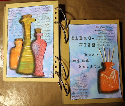
It was so relaxing to create that spread like having an aroma therapy. So I am linking my spread up to Journal 52 prompt: aroma therapy.

Posted in Art Journal, Gelli Arts, Showcase | Tagged , , , , , , , , , , , , , | 28 Comments

Natural Nautical take one

Did you know that Tattered Angels has an inspirational colour palette every week? This week it is Natural Nautical!

Here is my home decor piece for that palette.

It is a wooden heart, that first I painted white with High Impact paint, then I sand it to add a bit of a weathered look.

I used Prima marketing stencil with black High Impact paint to add my anchor. Using rich brown simply sheer I coloured a piece of cambric and I applied it on my heart with a shell.

Here is a close-up:

I added hemp rope around my heart. At the end of the rope I added to small shells.

The word nautical I printed on linen paper, underneath I added some thread and a piece of burlap. I hanged my heart on grey hemp rope.

So don’t you miss the sea and the beach already? Winter is nearly over, and till then you may create to decorate your home with natural nautical feelings.

Posted in Home deco, Mixed media, Showcase | Tagged , , , , , , , , , , , | 16 Comments

Whotcha doin?

Did you ever send a card to somebody only to say hello? Or to ask hey, howdee? Why do we always need a reason like birthdays, new year, or Valentine. I made a card just to drop saying: hey whotcha doin?

First I used a simple white card stock and coloured it with Tattered Angels simple sheers (sweet violet and very purple).

Loved that purples. I used Stampers Anonymous texture stamps (SCF 006 and CMS 125) with archival ink to add some stamped texture.

Next I used a harlequin stencil with texture paste to add even some dimensional texture.

That point I took my card and I was beginning to play with my background, I cut it, distressed the edge, added more colour to the dimensional stencilled texture with distress ink (seedless preserves), and layered them.

I stamped Buru from Stampotique originals on a white card stock and coloured him. I added him to my layered card.

Finally I added my “whotcha coin?” stamp on an apart white card stock.

So don’t forget to drop a card in the post from time to time, no special reason needed and still you show your interest in your friend, acquaintances or family!

I am sharing it with Craft Stamper’s Take it Make it february challenge: stencilling.

Posted in Cards, Showcase | Tagged , , , , , , , , , , , | 16 Comments