
Our days are still getting shorter. There is more lights needed. I live in the city and I just love looking out the window after sundown, and that is pretty early lately. I love watching all that flickering little lights close and far. They try their best to break throw the thick blanket cover of the darkness. So here is some light in my altered book:
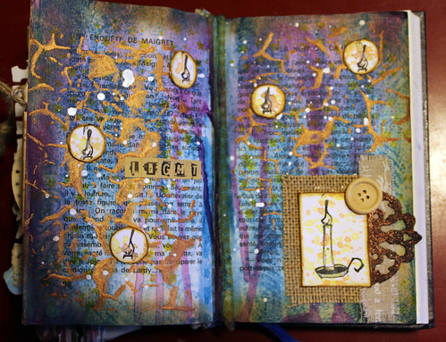
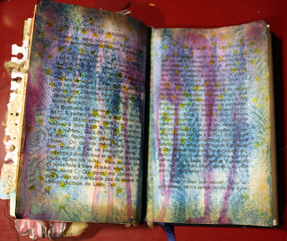
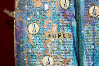
First I coloured my spread with acrylic paint, quiet waterish so the book page will come through. Then I let a purple colour of acrylic ink drop down from the top. I had the feeling that those blue and purple shades belong to the night.

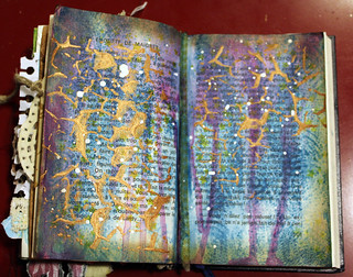
Then I added some more darker shading at the edges with distress ink (walnut stain). I used my favourite Stampotique stamp, France Papillon’s design cube (#10012) with archival ink to break the darkness and bring some flickering stars.
Than I decided that I would like to have some more texture so I applied some copper crackle texture paste so a crackle stencil. And finally I splattered randomly some white ecoline on top of the spread.
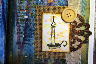
In one corner came Daniel’s cancel stamp (#6159) coloured only with splatters, like a real candle if it drops. Of course I had to add a piece of burlap, some canvas fringe and a self altered embellishment with a wooden button.
In small circles all around sits little flames all from the same stamps, like little floating light that tries to break through the night. I used letter stickers to add the word Light to my spread. As ’tis time of the year’ lights are shining bright every part of the world.
Hope you are going to have a bright weekend. I am sharing my spread with Stampotique designers challenge anything goes week 2.


Precioso, me encanta todo lo que haces
Thanks Mònica 🙂
De-light-ful spread Ruth! teeheehee Sorry, couldn’t pass on this one-xo
Thanks dear Jackie xox 🙂
it feels like a medieval night with all those candles 🙂 love your description of the days this time of the year, so accurate.
Vicky, thanks; I love candles at the long winter nights, somehow it adds a warm feeling to the room 😉
What a lovely page, Ruth; I can feel the power of that candle all the way from here!
Thanks Win 🙂
I really like this page Ruth. I am always wanting more light in the winter when the days get shorter and shorter.
Thanks Shel 🙂
Perfect colors for the night. I think your pages are fantastic. Thanks for letting us know how you made that beautiful streak of purples and lavenders.
Thanks for visiting Faye 🙂
Lovely! The purply-blues are perfect for night. Candle drips work so well on this piece, love the altered embellishment.
I came from a big city and miss the hubble bubble and lights at night all the time, happy to see Christmas lights :).
Thanks Jaded, I can’t live without the city 😉
ThiS reads beautifully as “night” Ruth. Love the spider web-by gold layer!
Thanks Vicki 🙂
It’s really lovely to see your pages transform and come to life dear Ruth.
Thank you for sharing the Light so beautifully!
oxo
Thanks Patty 🙂
I love the dark nights and love to see lights and illuminations breaking through the darkness. Your pages are glorious – the night colours with the gold are a rich combination and oh, sigh that adorable candle stamp.
Another on the wish list? I knew you are going to love it 🙂
Ruth, your journal spread is truly beautiful! I live in the suburbs, yet see the lights of the city across the pond! It can be magical, for sure, as is this artful creation. Love the candle! Thanks so much for participating in the Stampotique Designers’ Challenge!
Thanks for visiting Kay 🙂
I always find it odd that the days start getting longer on the first day of Winter, which is the 21st of December. We’re coming out of darkness but going into Winter. I like having lots of fairy lights up all over the house at this time of year, and not just for Christmas. It makes me look forward to night fall and the colourful lights make me happy! Your page reminds me of that feeling!
Thanks Zsuzsa, than my light were coming through!
How lovely to do a spread on light when the nights are so long and dark and the days often gloomy! Love the light and love your page and how the bookprint shows through the interesting layers.
Thanks Susan 🙂
Beautiful page – we all need light in the dark days of the year. Valerie
Thanks Valerie 🙂
Lovely spread. Love the little ‘lights’.. Thanks for joining us over at Stampotique !
Corrie x
Thanks Corrie 🙂
You are so right Ruth the blue and purple are perfect colours for your night background and i adore the crackle and candle. A perfect set of journal pages 🙂 xxx
Thank you xox 🙂
Such a fab page! Thanks for joining us at Stampotique.
Thanks for visiting Karen 🙂
Great project Ruth!
Thanks for joining us at the Stampotique Designers Challenge 🙂
xx Arwen
😉 xxx
love this.
Thanks! 😉